Flexbox gutters and negative margins, mostly solved
One of the key advantages of CSS Grid over Flexbox is that Grid came with the grid-gap property—which is now becoming just gap in future browser implementations. grid-gap magically does the work of calculating the spaces, horizontal and vertical, between grid items without having to add padding or margin and fussing around with calc and nth-child to figure out how much space is left to divvy up. It is breathtakingly easier.
Soon, gap will no longer be just for Grid, thus the name change. We’ll be able to use it to set gutters in Flexbox. But that’s a ways off and we’re using Flexbox now, everywhere. So let’s solve this problem.
If we want specific gutters, why would we use Flexbox over Grid?
– Flexbox still has wider browser compatibility
– Flexbox is, well, more flexible: if we happen to have one extra image in a three-column photo gallery and we want it to span the full width automatically instead of leaving two columns of empty space, we need to use Flexbox.
The issue of flexibility also prevents us from using obvious solutions such as last-of-type or nth-of-type to remove margin on a single side because we don’t know what that n will be.
If we have a single Flexbox row, no wrapping, we can set horizontal gutters easily:
CSS:
.flex-parent > *:not(:last-child) {
  margin-right: 1rem;
}

/* or */

.flex-child:not(:last-child) {
  margin-right: 1rem;
}
:last-child is element-agnostic—it will use whatever the final element of the parent is—so I prefer the first implementation because literally anything can be inside the Flexbox parent and it will be spaced correctly.
But we need something more heavy-duty for Flexbox “grid” gutters.
Negative Margin
Turns out is a hack for this, which I learned about in Heydon Pickering’s Making Future Interfaces: Algorithmic Layouts video.
As he describes it, it might look a bit like this:
HTML:
<div class="flex">
  <div class="item">Item</div>
  <div class="item">Item</div>
  <div class="item">Item</div>
  <div class="item">Item</div>
  <div class="item">Item</div>
</div>
CSS:
.flex {
  display: flex;
  flex-wrap: wrap;
  margin: -1rem;
}

.item {
  margin: 1rem;
}
Margin collapse does not exist inside a Flexbox, which means all children now have 1rem of margin on all sides, creating equal 2rem gutters between them—just like grid-gap. The issue is the 1rem of margin all around, which creates uneven design and prevents flush sides.
By setting an equal negative margin on the flex parent, it appears we solve this problem.
Let’s see this visually.
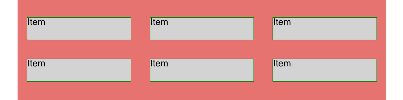
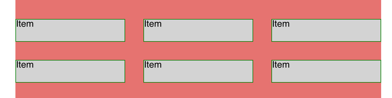
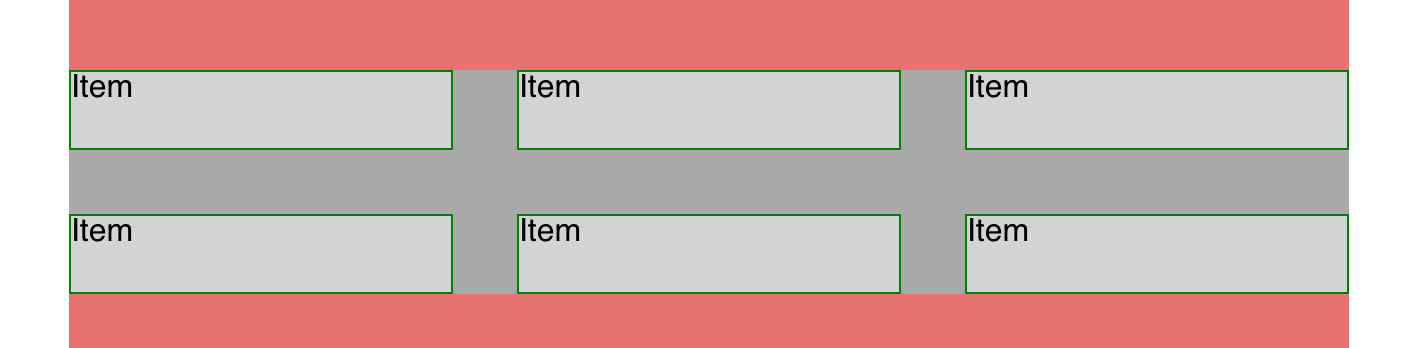
Here’s a Flexbox grid with no margin.
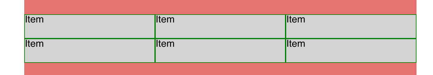
Here’s 1rem of margin on each child. This creates nice 2rem gutters in between as well as the extra 1rem border that we want to remove.
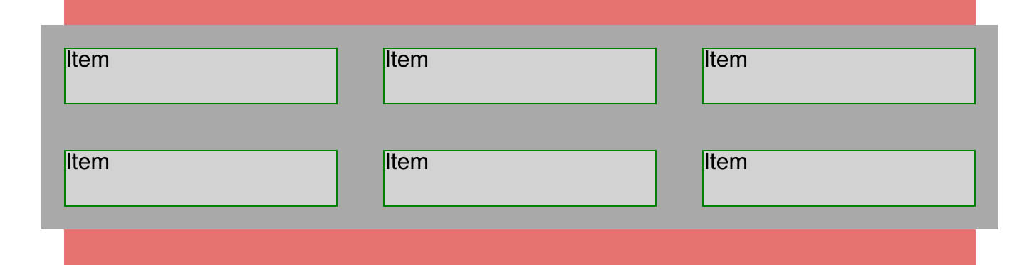
Now we add a negative margin to the parent. Success! We made grid-gaps!
Uh-oh.

It turns out that negative margins do introduce new problems:
– the negative margins expand the parent, so background colors and borders cannot be used or they will override the surrounding elements
And more importantly, for a full-width grid, in a left-to-right website:
– margin: -1rem; creates 1rem of overflow on the right-hand side, creating extra space and a horizontal scrollbar. This is the one we really want to avoid.
Both of these make throwing down a negative margin risky to use, or at least requiring special care. But we can mitigate these issues.
Making Negative Margins Safer
There are a couple of approaches I am interested in.
– removing right-side margins
In a left-to-right website, left margins won’t create overflow. They’ll just push harmlessly into the empty space outside of the browser. So instead of using margins all around, we can be more restrictive:
.flex {
  // ...
  margin-left: -1rem;
}

.item {
  margin: 0 0 1rem 1rem;
}
Now we have equal 1rem gutters vertically and horizontally, we’re going to keep the bottom margin, and we only have to worry about the left margin.
If we’re not adding any further styling—background colors or something else that can overflow—we’re done.
If the grid in question is going to be on the left side of the screen, with nothing to overflow into, then we’re safe to use background colors. (Borders will still be off in space so you’d be missing a side.)
For content like a photo gallery that’s going to appear in a column or content section, I think this is enough. You just don’t want to run into the right-side problem. We can do more, though:
Hiding Overflow
But we might want to use the original margin: 1rem; method or even just be sure our left margin won’t cause any problems. We can do that with overflow: hidden;. This needs to go on the parent of the flex parent, like this:
<body>

<div class="container">

	<div class="flex">
	  <div class="item">Item</div>
	  <div class="item">Item</div>
	  <div class="item">Item</div>
	</div>

</div>
And then:
.container {
  overflow: hidden;
}

.flex {
  // ...
  margin: -1rem;
}

.item {
  margin: 1rem;
}

/* or */

.container {
  overflow-x: hidden; /* left and right only */
}

.flex {
  // ...
  margin-left: -1rem;
}

.item {
  margin: 0 0 1rem 1rem;
}
My gripe here is overflow: hidden is a brute-force tool that’s usually used to disguise issues in layouts which have failed to become truly responsive. In this case, however, we do have legitimate, useless overflow that we need to hide, and it’s the right tool for the job.
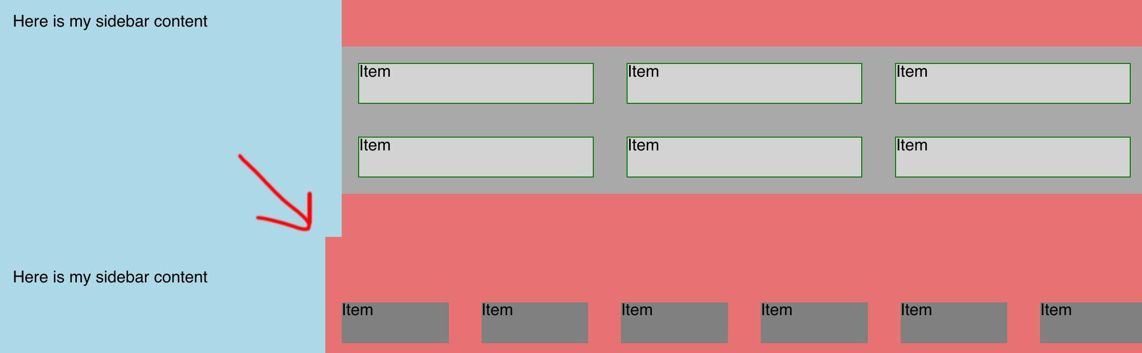
So let’s say we’re using margin all around and we’re back at this step:
The neatest way to solve this is to wrap the flex parent in its own parent container just as a wrapper for this element, and then use overflow: hidden on the whole thing.
Fixed! And because we have isolated overflow: hidden around our element, we won’t run into any layout bugs by putting it on a bigger container. The other benefit is we can now use background colors, borders, etc. on this new wrapper element.
We can’t always add this safety wrapper, though, as in cases like a WordPress gallery where the markup is set and our parent container is going to be the whole column for the page content. In this case, we can still use overflow: hidden—with the awareness that we now have our brute force instrument applying to anything else we have in the container, and only solving our Flexbox margin issues for the top and bottom if those sides are hitting the top and bottom of the container.
So in this case, for content we can’t wrap up directly, the 100% solution is to stick to using negative margins on the horizontal sides and then clipping them with overflow-x: hidden.
One more wrinkle
In a Flexbox, adding margins to children takes up the box’s available space and shrinks the children. (Unless widths have been fixed.) Subtracting margins does the opposite: it makes the children bigger.
This means you can’t use this technique on a flex parent which is itself a flex child. Or, you can, but it will change the sizing of your layout: if your margin-left is -1rem, then your parent will expand left by 1rem. (I haven’t tested this on a flex parent inside a grid fractional column, but I assume a similar thing will happen.) And because there is no non-flex parent at all, we can’t hide the overflow.
So this layout is fine:
<main class="main"> <!-- a flex parent -->

<aside class="sidebar"></aside> <!-- flex child -->

  <section class="content"> <!-- flex child but not a parent -->

    <div class="flex-parent"> <!-- flex parent for the grid -->
      <div class="item"></div>
    </div>

  </section>
</main>
The .content section can be used with overflow: hidden no problem. This is a more typical layout, I think.
But this layout is going to give you trouble:
<main class="main"> <!-- a flex parent -->
  <aside class="sidebar"></aside> <!-- flex child -->

  <section class="content flex-parent"> <!-- flex child and a parent - don't use negative margin here -->
      <div class="item">Item</div>
      <div class="item">Item</div>
      <div class="item">Item</div>
  </section>

</main>
You could set a max-width on this but then what happens is the negative margin just drags the whole thing over and you’ll get an extra gutter.
Weird flex, but O.K.
Our final options for true Flexbox grid gutters are:
– overflow: hidden on container for the flex parent to hide the negative margin, a negative margin on the flex parent to hide the gutter excess, and positive margin on the flex children to create the gutters. Can style the wrapper with backgrounds and borders. This is the most custom and cleanest approach, but means we need a wrapper element.
– overflow: hidden or overflow-x: hidden on a container when we can’t wrap the flex parent directly, and stick to horizontal negative margins which the container will clip. Background colors safe to use.
– Don’t use overflow: hidden; use left margins only to create the gutters to avoid overflow; safe enough if you don’t need to add styling.
– Make sure there is a non-flexible container on the top level for the best results.
Happy flexing.